 To use two different colours, I carved two seperate lino blocks, and then only partly mixed the colours with the rollers to give a more interesting effect (although you can't really see this in the poor quality scan).
Monday, 12 September 2011
Dragonflies
 To use two different colours, I carved two seperate lino blocks, and then only partly mixed the colours with the rollers to give a more interesting effect (although you can't really see this in the poor quality scan).
Sunday, 11 September 2011
Typography
One of the reasons I decided to give lino printing a go was the idea that it would act as a way of reproducing my cut out text. Cutting out of paper is a laborious process, whereas printing, once the alphabet has been cut out of lino, has lots of possibilities. The result is quite rudimentary, but it is perfect for personal cards and gifts - and it could still work in a children's book, mimicking child's play and finger painting...
Saturday, 10 September 2011
Experimenting with colour
Get well soon cards
I like little projects that have a short deadline reach, like personal birthday cards or invitations - it makes sure that I have focus and I'm not too precious about the finished result - as it already has a definite purpose.
To wish my mum well recently I created a lino print of her favourite flower - an open tulip, and have experimented with different colours and backgrounds. I'm really enjoying using a simple, traditional technique which results in hundreds of different prints!
Thursday, 8 September 2011
Engagement present
I am currently undertaking a slow burning project (see 'First Book Project' blog) so other illustrations have been put on hold. However, I miss finishing things, and I wanted to try something new, so I've taken up lino printing. And I love it, it is so satisfying. I get absorbed in the process of drawing, tracing onto the soft lino surface, and carefully cutting out - both delicately and forcefully. And then the best bit is splodging out thick bits of colour onto a big piece of glass, getting a roller to spread it out and roll it over the carved lino block, and then printing it for the first time, revealing a new image. And after all the hard work - you can just print the picture again and again, different colours, different papers - one image hundreds of times! It is so brilliant when I am used to carefully cutting paper out and being either left with just one image, or having to photograph it and expensively digitally print it. This was I am fully in control of the finished project.
Here is a present I've made for two newly engaged friends (it is slightly sickly, but thats weddings for you!) - I like the primary colours...

Tuesday, 11 May 2010
Cheltenham Illustration Award application
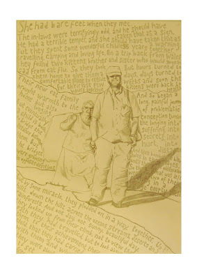
The title for this year's awards was "Traveller's Tales", and my take on this was taking a sketch of my parent's walking up a hill, surrounded by their story (a very simplified, succinct version) which is partly based on fact, predominantly based on fiction.
This is the finished cut out (1222 letters - it took a good 8 hours of "careful" cutting, with a couple of accidents).
I was going to take a photo of all the alphabetical dandruff that was subsequently scattered all over my room, but my hoover-mad housemate decided to clean it up before I had chance.
Anyway, here is it on a white background, nice and lacy:

And here is the finished piece taken from on top of the light box:
Thursday, 22 April 2010
Pub Work
I have recently started some work based upon my shifts working at the local pub. Regulars are often more recognizable by what they drink, rather than by name - so I'm creating characters based on their drink of choice (fitting the text into the specific glass shape).

Taking sketches of punters drinks - I put them on top of a light box. And then cut out the text in the shape of the drink, which can be painstaking - but I am left with tiny confetti-like letters covering the desk...

 Layering various pieces of paper on top of the light box - you can see through to each layer.
Subscribe to:
Posts (Atom)


